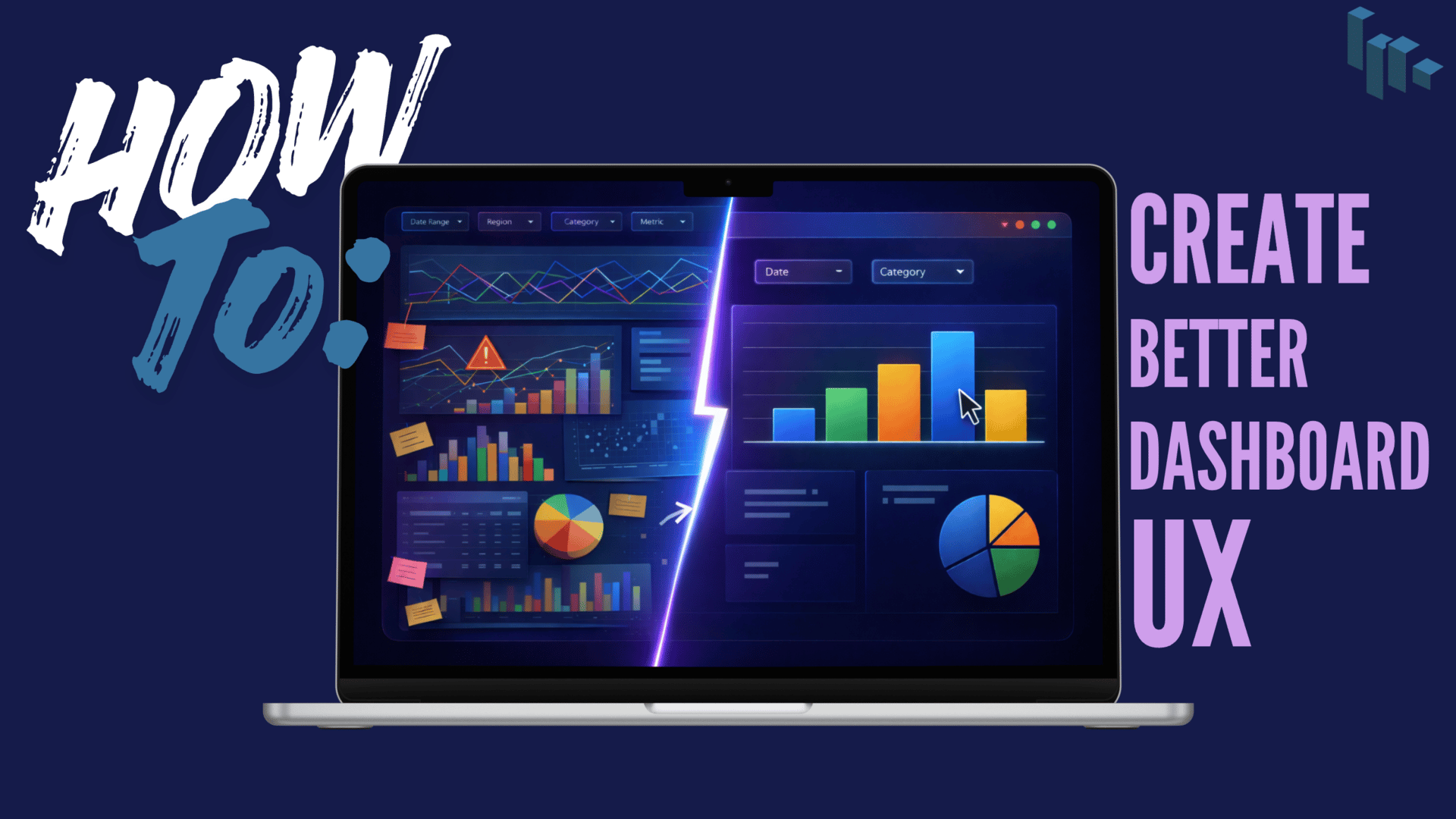
It’s going to be a great week. No specific reason, just tossing good vibes your way. In this issue I’m sharing best practices my team and I have implemented over the years that have shown tremendous improvements to the ~User Experience~. The features that had our end users going, “Sorry for loving that I don’t need to ping you anymore for that” ← (real feedback might I add).
I’ll admit, this week’s inspo is a rip-off of an article I published for the Power BI Masterclass community, but it’s been shared thousands of times across LinkedIn and X (Twitter) I figured it could use an expansion here.
Building Better UX in Data Visualization Platforms
Why is this important or relevant?
A deep dive into User Experience (UX) theory is outside the scope of this issue. But if you want the full breakdown, I linked an article* in the TLDR section. In one sentence though: UX is how intuitive, efficient, and satisfying it feels to use something from start to finish.
And whether we admit it or not, every data professional is a UX designer to some degree.
Take Power BI for example. Long before we place visuals on a canvas, we’re already making decisions that affect UX: how metrics are grouped, which comparisons matter, what questions a user might ask next, etc..
When UX is poor, it doesn’t matter how good the analysis is. If users can’t quickly understand or confidently interact with a report, the value of the work drops instantly. I’ve seen this firsthand, and it’s exactly why small UX improvements often create the biggest impact.
Small Changes That Can Be Made Today That Improve UX
One of the simplest methods: showing the report’s last refresh date.
It sounds trivial, but I’ve seen this single addition dramatically reduce Teams messages like “Is this data current?” or “Does this report include today’s numbers?”. By communicating data freshness upfront, users immediately know whether they can trust what they’re seeing, without asking and waiting for a response from you.
In my article “5 Simple Power BI Features That Instantly Improve User Experience”, I shared examples like last refresh dates, intentional help buttons, and drillthrough techniques. Features that stopped users from pinging us with follow-up questions and helped them self-serve answers instead.
This week’s topic was: helpful / not helpful
🕹️ Trivia
People can process images in as little as ____________.
A. 13 milliseconds
B. 90 milliseconds
C. 1 second
D. 2 seconds
Answer at the bottom of this issue
Interesting Reads (TL;DR)
*What Is UX Design? A Guide for Beginners by Meg Clayton
If you are interested in learning about UX in more detail check out this article. It does a great job at introducing the concept with plenty of familiar examples without diving too deep into theory. Read more
UX Data Visualization Best Practices for Effective Design by WDG
A broader UX take on dashboards and data displays. Helpful for grounding why experience matters beyond just tooltips. The unique words visualization is pretty neat too. Read more
Atlassian (Case Study) by Buzzborne
In redesigning JIRA, Buzz Usborne focused on helping users realize value faster by reducing friction in an otherwise complex tool. User research and continuous testing turned each design decision into a hypothesis that was validated and refined through feedback. This mirrors how we work in business intelligence: start with a problem, test assumptions, iterate, and make insights easier to access and trust. Read more
Resources & Tools
Mokkup #data-visualization #productivity
One of my go to tools for mocking up a dashboard. The free version comes with 3 canvases to build a mock dashboard. Perfect for brainstorming, sharing drafts with clients, and students.
Icons8 #data-visualization #productivity
It can be tough finding the right icon for the right use case. Especially when you are building custom reports and might need something with a transparent background, or the color theme changes at the last minute. I’ve been using Icons8 for several years, it’s free and consistently good.
This Week’s Quick Study
▶️ Using Design Techniques for Clear and Appealing Data Visualization by nullQueries (4 mins)
Kudos to this YouTuber who created a brief, straight-to-the-point video on how anyone can apply UX design to data. In just under 5 minutes anyone can watch this video and have a better understanding of how UX and Data Viz blend to create better solutions.
Classifieds
PlotStack readers take 50% OFF with code DATAVIZ50: Learn how to design visuals people actually understand. Data Visualization: An Audience-First Approach teaches you how to create dashboards and stories that inform, inspire, and drive decisions.
This free 5 day microcourse covers 5 Power BI Conundrums every analyst faces throughout their career. Enroll Today!
Classifieds are paid ads that support PlotStack and are seen by hundreds of readers.
Book an Ad with me →
🕹️ Answer
People can process images in as little as _______________.
A. 13 milliseconds
B. 90 milliseconds
C. 1 second
D. 2 seconds
An MIT study found that the human brain can process images in as little as 13 milliseconds. (MIT) Wild, considering the average blink lasts between 100 and 400 milliseconds.
How was this week’s issue?
(No sign in required - just click)
Have more to say? Submit feedback here.
If PlotStack helps you think more clearly about analytics and business decisions, you can support it by gifting me a coffee ☕
Every coffee helps keep the newsletter free and focused on practical insights.


