Happy New Year! (Get ready to hear that in just about every medium of communication for the next several weeks). If you missed the last issue with holiday travels and unplugging, I got you.
A new year invites reflection, especially in a field that’s evolving as quickly as data and AI. With more tools, resources, and shortcuts than ever, it’s easy to feel like you should be learning the next shiny new thing.
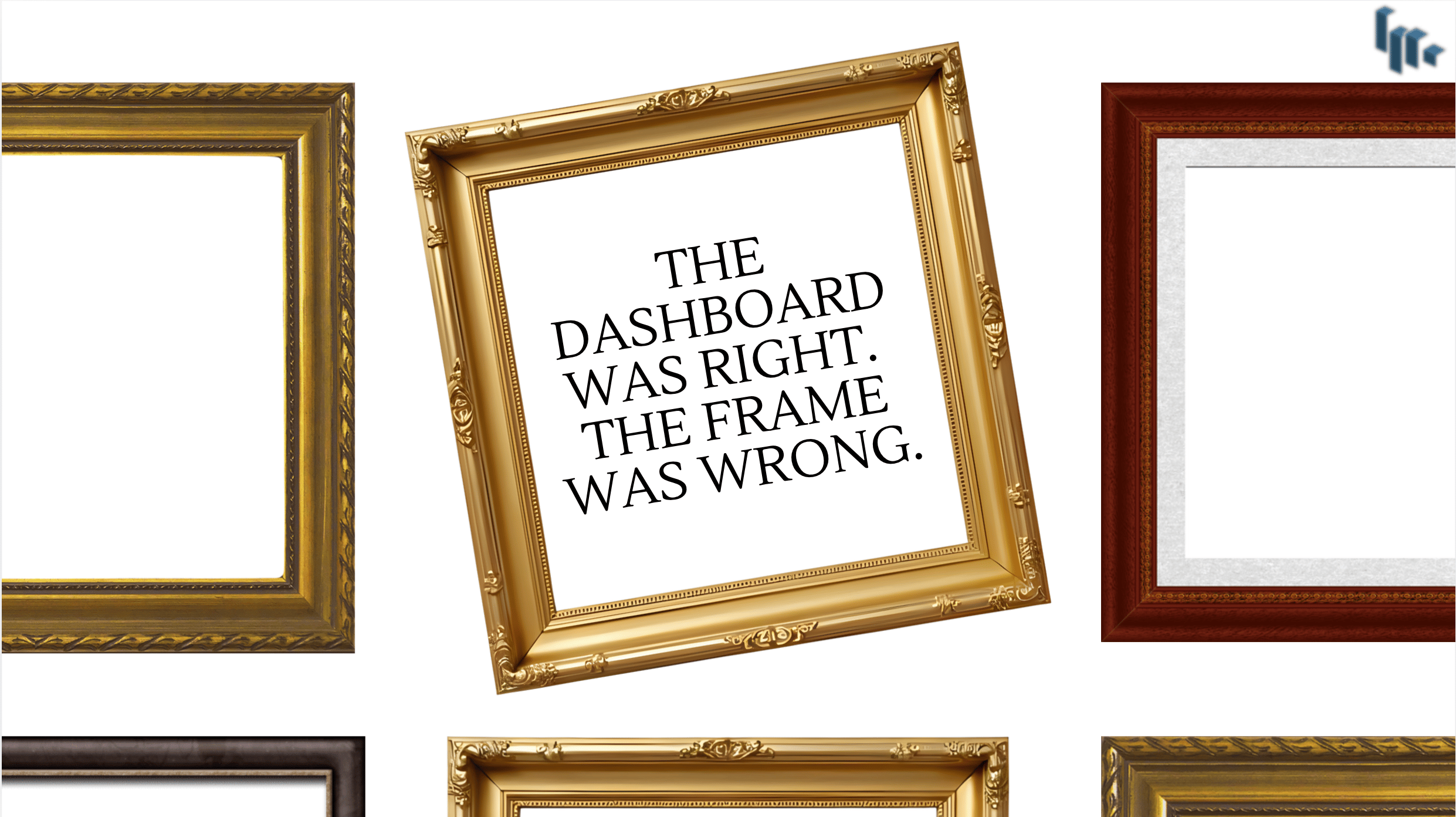
(Food for thought) maybe that’s not the right starting point for 2026. Instead of getting lost in the tornado of learning new trendy tools in tech, doubling down on your interests and natural skills could be the key to setting yourself apart from what everyone else is doing year after year.
I’m putting together some goals for myself in 2026 and this year I’m shifting my mindset from “What tool should I learn next?” to “What part of this field do I enjoy enough to go deeper than most people ever will?”.
🕹️ Trivia
How old is the data visualization tool, Microsoft Power BI?
A. 7
B. 10
C. 13
D. 18
Answer at the bottom of this issue
What's Going To Set You Apart in an Ocean of Data Professionals?
How I Blend My Interests Together to Stand Out in Tech
When I was working on my Master’s in Data Science, I could have leaned harder into machine learning or deep learning. Those areas were exciting (still are), but something else constantly pulled at my attention: communication through data visualization.
I enjoyed turning data into clear stories my peers could understand. Building decks and dashboards people actually wanted to look at and explaining complex ideas to people.
Visualization wasn’t just a requirement for me, it was the part of the work I looked forward to. This was something I noticed about myself well before I pivoted into data. So I really leaned into that once I was exposed to more data viz tools and techniques. And not just the execution side of data viz, but the theory as well. What styles people respond best to, using color and contrast strategically, white space strategies, among many others.
Since then, I’ve built hundreds (probably thousands) of visualizations ranging from simple slides to executive dashboards to web-based business case studies. Having a background as an editor and writer, I started writing about visualization principles online, sharing what I was learning, and documenting how small decisions in design and storytelling change how data is received by people.
Over time, that interest became a passion which turned into:
A recognizable theme in my work
A growing body of content that I can call mine
My own small brand built around tech education, data storytelling, and audience-first design
And this wasn’t even some grand plan either. I was just following what I naturally enjoyed. But looking back, I realize I was nurturing one of the critical characteristics that sets me apart today.
My advice for anyone looking to find their differentiator in this vast field [data] is to focus on your interests and what you enjoy doing NOT what people on the internet say you should be interested in.
And that’s my Ted Talk!
Interesting Reads (TL;DR)
The Top In-Demand Data Science Skills of 2026 by CoBloom’s SaaS Careers Team
Although Data Science specific, more senior level analyst roles are dipping into DS methods. Trends show us employers are looking for professionals well-rounded in these skills. Professionals who not only can mine and transform the data, but communicate the results in a way companies can act on. Read more
How to Find Your Passion in the Tech Industry by Brittany Ellich
Six tips to finding what gets you up in the morning in the vast field of technology. Whether in UX Design, Analytics, Data Engineering, or Data Science, these can be easily applied across the field. Read more
Relying too much on AI could quietly damage your confidence — and your career prospects, think tank CEO says by Thibault Spirlet
Since there should be balance in everything. AI helps, but don’t outsource your depth to it. This recent article argues that overreliance on AI tools can overtime hurt your core skills and confidence. It’s important not to lose your human expertise like communication and critical thinking. Read more
Resources & Tools
Charticulator #visualization #productivity
Charticulator is a free, open-source, no-code tool developed by Microsoft Research that enables users to design bespoke and reusable data visualizations directly in the browser using drag-and-drop or touch.
SankeyMATIC #visualization #productivity
Another neat viz tool specific to sankey diagrams. Create custom diagrams with SankeyMATIC. A super easy web builder you can learn in under 1 minute. (I use this for my monthly personal budget)
This Week’s Quick Study
▶️ Every Tech Job Explained in 10 minutes by Privacy Matters (10 mins)
An interesting video I came across that describes 24 tech jobs in about 10 minutes! In an alternate reality I think I would have loved to be a Gray Hat Hacker 👨🏻💻
Classifieds
PlotStack readers take 50% OFF with code DATAVIZ50: Learn how to design visuals people actually understand. Data Visualization: An Audience-First Approach teaches you how to create dashboards and stories that inform, inspire, and drive decisions.
Simplify your workflow with free Notion templates trusted by 1,000+ users. Thoughtfully designed to keep your goals, projects, and ideas in perfect sync.
Classifieds are paid ads that support PlotStack and are seen by hundreds of readers.
Book an Ad with me →
🕹️ Answer
A. 7
B. 10 ✔️
C. 13
D. 18
Power BI was officially released in July 2015 making the platform 10 years old.
If PlotStack helps you think more clearly about analytics and business decisions, you can support it by gifting me a coffee ☕
Every coffee helps keep the newsletter free and focused on practical insights.


